
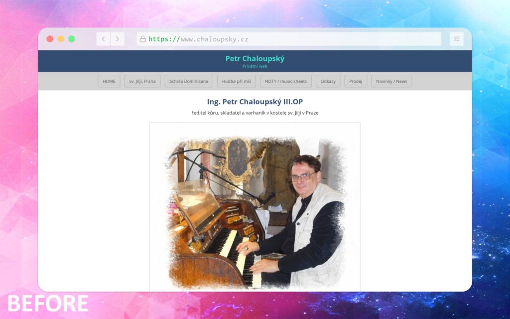
Recently, I came across the personal website of an experienced and highly talented organist based in Prague:
👉 http://chaloupsky.op.cz
Playing the organ especially historic church organs is a rare and demanding craft. It requires not only technical skill, but also deep musical sensitivity, discipline, and respect for tradition. People who dedicate their lives to this kind of work usually focus on the music itself, not on digital presentation. And that is completely understandable.
Still, as someone who enjoys working with websites as a hobby, I couldn’t help but think about how such a personal site could be gently improved without changing its essence.
Not reinventing the wheel
I did not want to redesign the site “for the sake of redesign.”
No visual experiments, no unnecessary trends, no aggressive modern effects.
Instead, I chose a very simple approach:
- keep the content and personality intact
- improve clarity and accessibility
- make the site more usable for real visitors
This was not a commercial project. It was a demonstration exercise a way to explore how small, thoughtful changes can significantly improve the user experience.
What I focused on
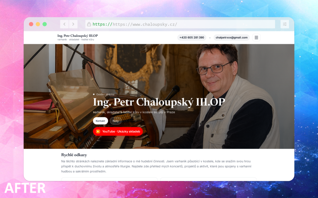
1. Clear visual hierarchy
The main image now plays a central role. It immediately communicates who the person is and what he does without explanation.
2. Emphasis on the most important links
From a practical point of view, visitors usually come to this site for very specific reasons:
- to find contact information
- to access sheet music (notes)
- to watch or listen to performances on YouTube
These links are now clearly visible on the first screen, without searching or scrolling.
3. Accessible contact details
Contact information was placed directly in the header, so interested visitors can reach out quickly and naturally.
4. Simplified navigation
The menu items were grouped into a burger menu to reduce visual noise and keep the layout calm and focused.
5. Responsive design
The site now adapts properly to mobile devices and smaller screens something that is essential today, even for very traditional fields.
About the demo version
Because this is a demonstration website, some elements may feel unfinished or slightly rough. That is intentional.
The goal was not perfection, but to show:
- structure
- priorities
- design thinking
Result
You can view the demonstration version here:
👉 https://varhanik-praha.netlify.app/
This small exercise reminded me that good design is often not about adding more, but about removing friction especially when working with meaningful, human-centered professions like music.